Posted: Tuesday July 04, 2023
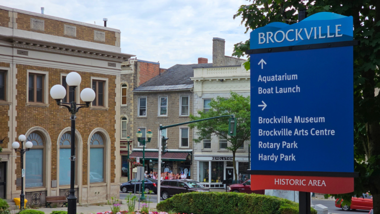
You may have noticed that a number of new signs have been installed around the city in the last few weeks. These signs make a significant step towards beautifying our streets and will allow us to remove a number of individual attraction signs that are faded and outdated and that visually ‘clutter up’ our streets. These signs are from part of a set of approved designs that adhere to our Tourism Wayfinding Sign Policy and represent the highest priority items from our signage plan.
What is Wayfinding?
“Wayfinding” is a term used to describe the process of finding a destination in the build environment. Signs play an active role in this process by providing the primary form of communication.
Goals for our signage:
- To create a cohesive sign family that is unique and recognizable, that will enhance the community, become a source of pride, and prompt visitors to stay awhile.
- To highlight and promote key attractions.
- To promote safe, enjoyable experiences.
- To celebrate historic, natural, and cultural elements.
- To provide clear safe navigation.
- Focus on positive messaging.
- Reduce the overuse of individual signs.
- To maximize value of investment through standardized design, use of long-lasting materials, and careful consideration for fabrication, installation, maintenance, and life cycle.
Design Elements:
- The signs make use of the official “Brockville City of the 1000 Islands” wordmark and tagline configuration throughout the wayfinding system.
- Use of white text of a blue background ties our signs visually to the Provincial tourism wayfinding signs, creating a visual consistency that helps the user recognize these signs as being directional signs to area attractions.
- Waves/water elements to signify the importance of the river (and signal to visitors stopping in off of the 401 that we are a waterfront community).
- Balance of heritage with modern elements or colours. Signs within the waterfront area surrounding the downtown make use of a “heritage area” footer rather than the “City of the 1000 Islands” footer used throughout the rest of the City.
- Use of a unique cut out shape other than a rectangle to easily identify and connect the signs.
We hope that our visitors find them effective and that our locals like the style and character that they bring to our streets.

